

Expedia
GROUP TRAVEL PLANNING ON EXPEDIA
FULL DESIGN CYCLE
UX DESIGN
CONTEXT
Designing a seamless group planning experience
Expedia is a leading travel platform for booking flights, stays, and vacation packages. This project focused on improving the group travel experience by simplifying planning, enhancing communication, and offering personalized recommendations. Through user research, iterative design, and usability testing, we created a collaborative feature that makes group trip planning more intuitive and enjoyable.
Duration
Winter – Spring 2024
20 weeks
My Role
UX Design
UX Research
Project Management
Tools
Figjam
Figma
Google Docs
Team
3 Designers
PROBLEM
The issue is that most people travel with 2 or more people.
Travel is often a shared experience—in 2024, only 16% of travelers chose to go solo. Despite this, Expedia's current interface is primarily tailored for individual trip planning, making it challenging for groups to coordinate preferences, share options, or make collective decisions. This oversight leads to fragmented communication, duplicated efforts, and a frustrating user experience for those organizing trips together.
SOLUTION
Making group planning simple, transparent, and fun.
Our design enables collaborative trip planning by introducing tools for shared itinerary management, streamlined group communication, and collective decision-making. With features like shared wishlists, group voting on activities, and real-time itinerary updates, we empower users to plan trips together efficiently — reducing friction, improving transparency, and making group travel smoother and more enjoyable.
USER INTERVIEW
87% said group travel planning feels harder than it should…
We surveyed 115 travelers about their group trip planning behaviors and followed up with 9 in-depth interviews, covering a range of travelers from students to adults. This mixed-method research uncovered the key frustrations, workarounds, and unmet needs shaping how people plan trips together.
Some questions we asked:
• Can you walk me through how you usually plan a group trip from start to finish?
• What parts of group trip planning feel most stressful or frustrating for you?
• How do you keep track of things like costs, activities, and logistics when traveling with a group?
KEY INSIGHTS
Insights that transformed our design approach
01
Travel groups need a shared hub
Users crave a single platform to consolidate communication, itineraries, maps, and budgets — minimizing the chaos of juggling multiple tools.
02
Balance control with collaboration
While one person often leads planning, features must support both centralized control and easy group input.
03
Encourage expressed preferences
Silent disagreements slow planning; we need to design ways to surface individual opinions early and smoothly.
04
Embed flexibility
Rigid plans frustrate users. Travelers want tools that let them adjust plans on the go without losing sight of anchor activities.
OPPORTUNITY
How might we make group travel planning smoother and more collaborative on Expedia?
IDEATION
“How can we make group planning effortless?”
As we began brainstorming solutions, we focused on how to make group trip planning less chaotic and more collaborative. Inspired by the idea of a shared space, we explored adding features like group polls, live itinerary edits, and expense tracking — all within a single platform. Since most users plan trips on mobile, we decided to prioritize a mobile-first design, ensuring the experience felt smooth and accessible on the go. We sketched out early concepts, centering the experience around shared lists, voting tools, and flexible schedules to balance structure with spontaneity.

Low-fidelity wireframes
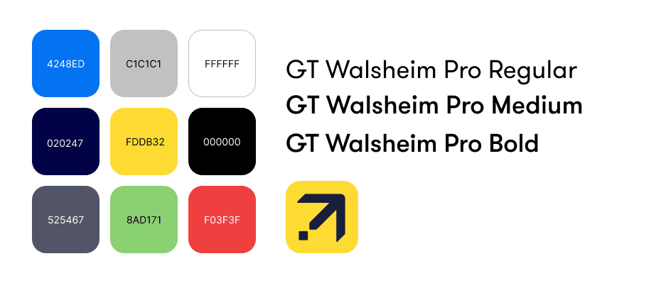
STYLE GUIDE
Establishing colours & fonts.
To ensure a cohesive look and feel, we created a shared style guide that defined our color palette, typography, iconography, and components. We drew inspiration from Expedia’s existing design system but expanded it to accommodate our new collaborative features — ensuring consistency across screens while improving clarity and accessibility.
USABILITY TESTING
Validating our design with real users.
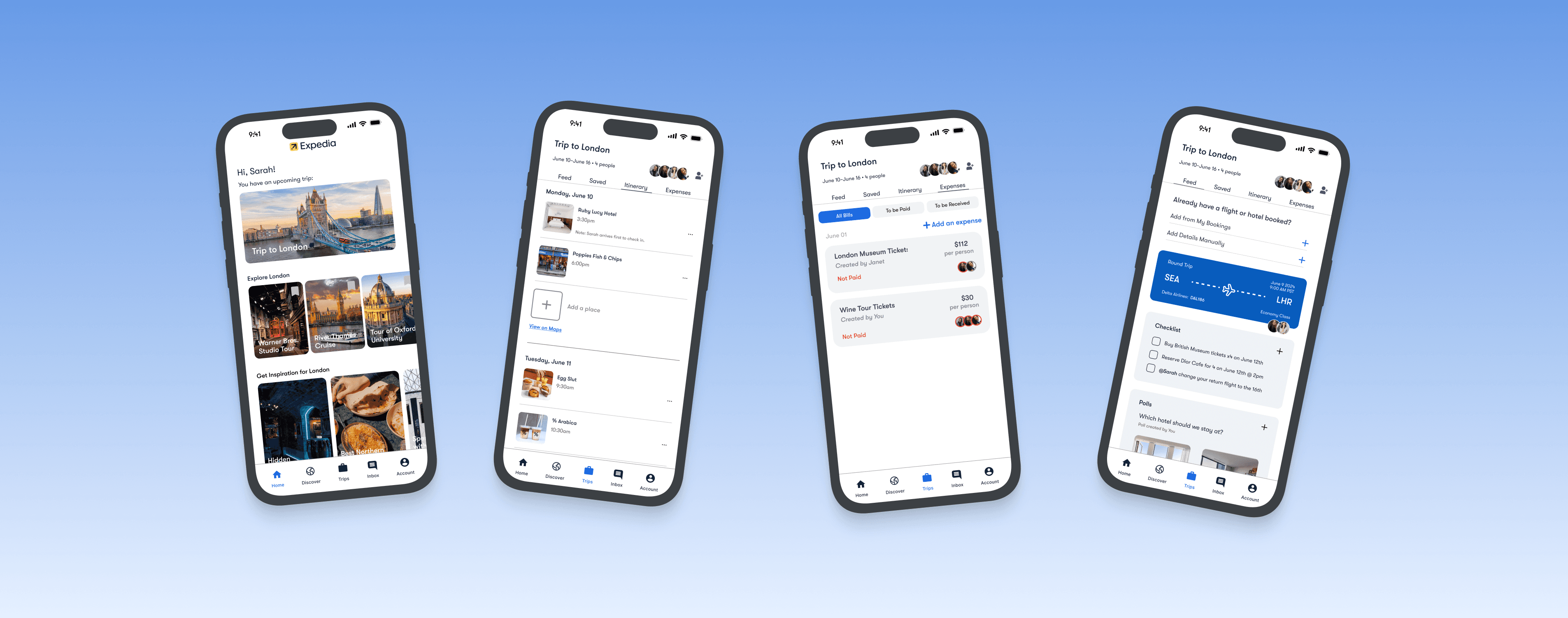
Once we completed the high-fidelity prototype, we ran a usability study with 8 participants over 3 days, supported by Expedia’s participant recruitment. We gave users 7 realistic tasks, such as planning a trip, adding expenses, creating polls, and navigating group chats, while observing how they interacted with the new collaborative features.
Our goal was to uncover how intuitive the experience felt, what worked well, and where users encountered friction. Feedback revealed that while features like expense tracking and itinerary sharing were well-received, areas like pinning items or viewing payment status needed clearer visual cues.
These insights guided the next iteration of our design, ensuring the product not only looked polished but truly met user needs.


Control panel where we speak to the participant through the microphone and see where they are pressing on the phone.
Two display for the rest of the team members to see and take notes.
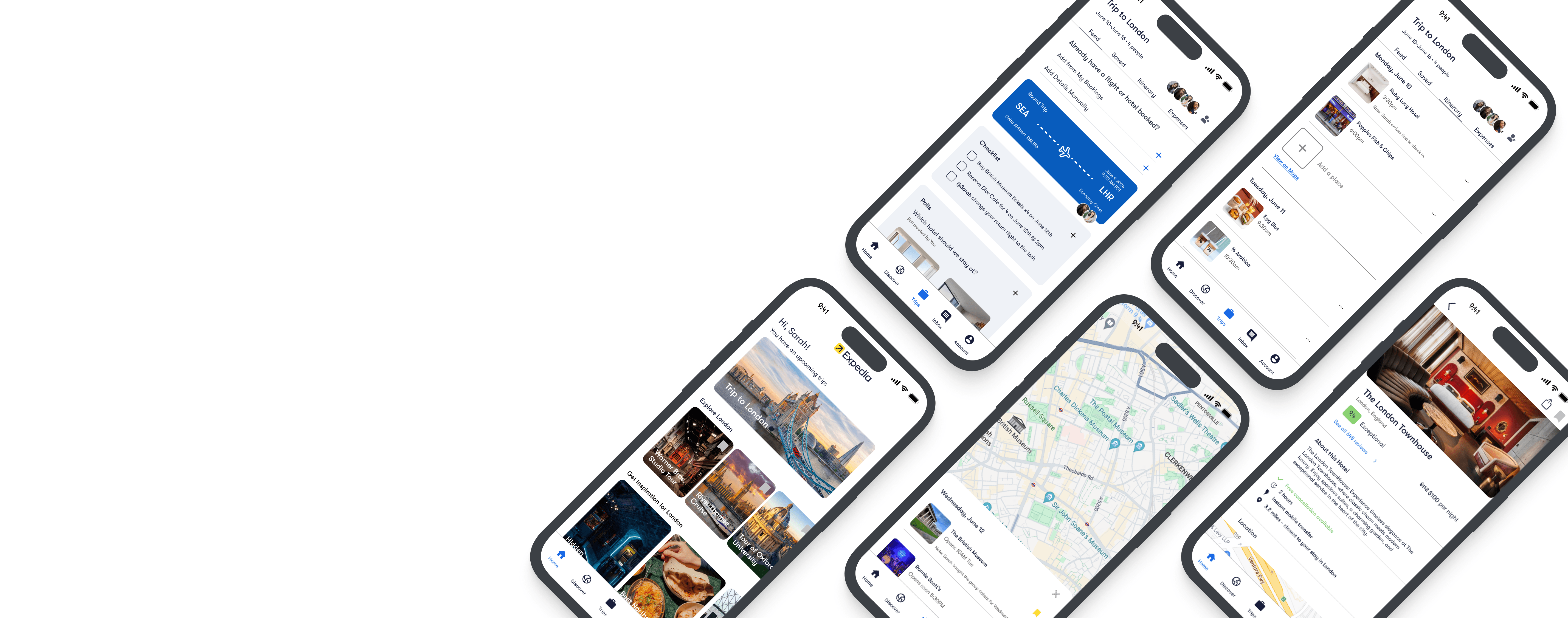
FINAL PROTOTYPE
Delivering a seamless group travel experience


CAPSTONE SHOWCASE
Final Deliverables: Poster & Demo
We wrapped up the project by presenting it at the Capstone Showcase, where we shared our design process, research insights, and final prototype with classmates, faculty, and industry mentors. We created a poster summarizing the project and a demo video to walk viewers through the key features of our solution. The showcase was a chance to reflect on our work, share our learnings, and celebrate the journey of designing a more collaborative group travel experience.
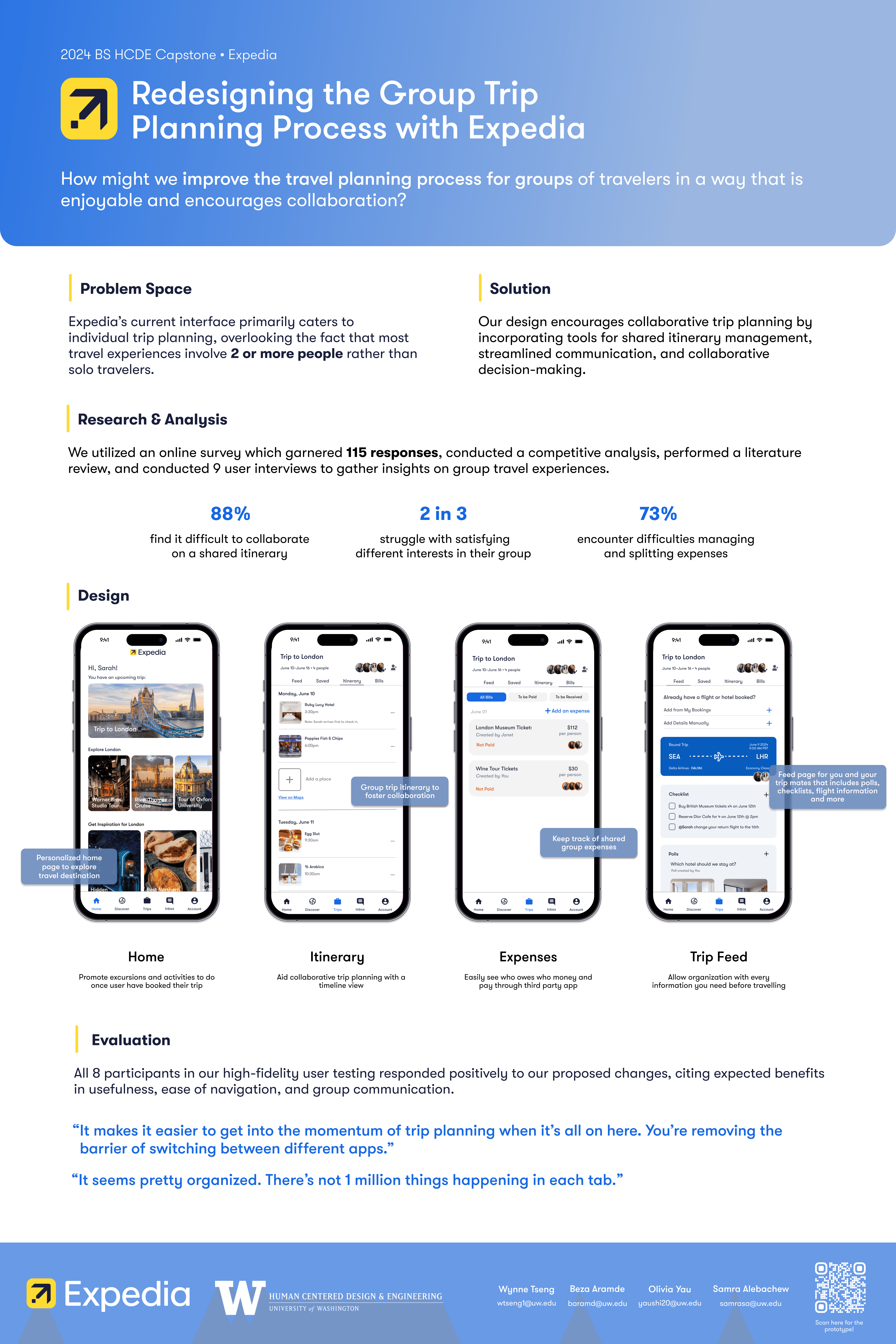
REFLECTION
Lessons learned along the way.
01
Designing for hidden friction
I learned that the biggest challenges in group planning aren’t always obvious — many users hold back opinions to avoid conflict, which actually creates more tension. Our design needed to help surface those hidden inputs in a gentle, non-disruptive way.
02
Feature effectiveness
Usability testing confirmed that while features like expense tracking were appreciated, enhancements such as clearer payment indicators are essential for improving functionality. Testing early and often was crucial to refining how well features met real user needs.
03
Growing as a cross-functional collaborator
This project helped me strengthen my collaboration skills by learning how to synthesize diverse team input, navigate feedback loops, and stay aligned on a shared vision.

